It's simple, delicate and unmistakable. A curved line, an organic movement, a light line that carries within it all the power of nature and regeneration. This is the Ibiti logo: a design that many people carry on their chests (literally), without always knowing its history.
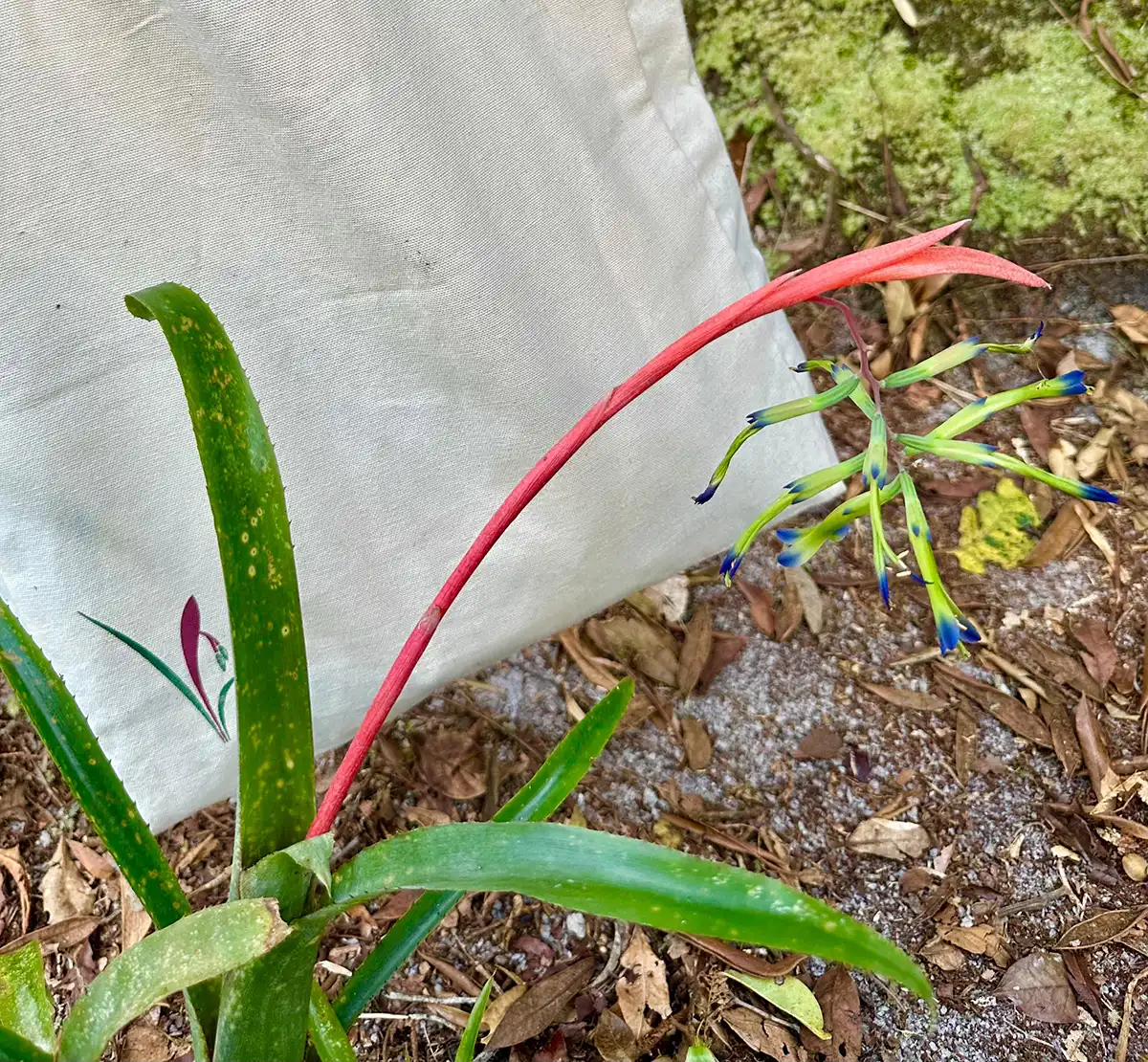
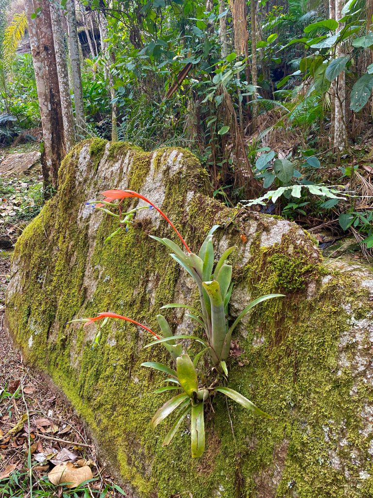
O símbolo que representa o Ibiti nasceu da ideia de capturar, em uma imagem única, tudo o que floresce por aqui: a beleza selvagem, a simplicidade da vida no campo, a exuberância da Mata Atlântica, o cuidado com o detalhe. E foi uma flor – uma bromélia nativa, presente na região – que inspirou tudo.
A Billbergia distachiafound in the walls and interior of the forest, was the muse of the artist from Minas Gerais Cacaio Souza. At the invitation of the project's founder, Renato MachadoHe walked up and down the trails of Pedra do Gavião, camera in hand, recording the shapes, colors and textures of the bromeliads of Ibitipoca. After many photos, studies and experiments, he arrived at the essential line.
"I developed several sketches and paintings until I arrived at the simplest, most elegant and easily recognizable form," says Cacaio.
The choice couldn't be more symbolic. Bromeliads are resilient plants that grow in unlikely places, shelter small ecosystems and are part of the cycle of life in tropical forests. Turning it into the project's emblem is a way of paying homage to the local flora and reminding us that, around here, everything starts with nature.
Ibiti logo tattooed on skin, engraved in history

Over time, the logo took on an even more affective meaning. It even became a tattoo! Many Ibiti employees have chosen to mark their skin with the flower symbol - as a living reminder of their connection to this place.
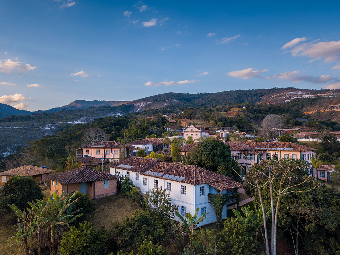
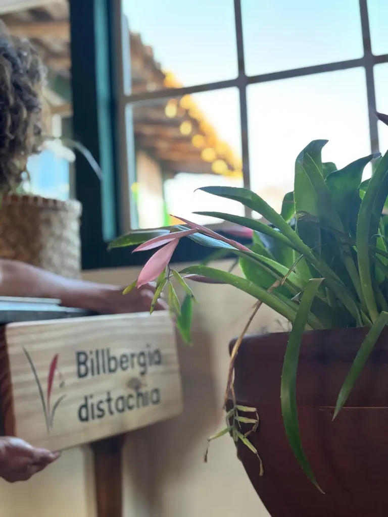
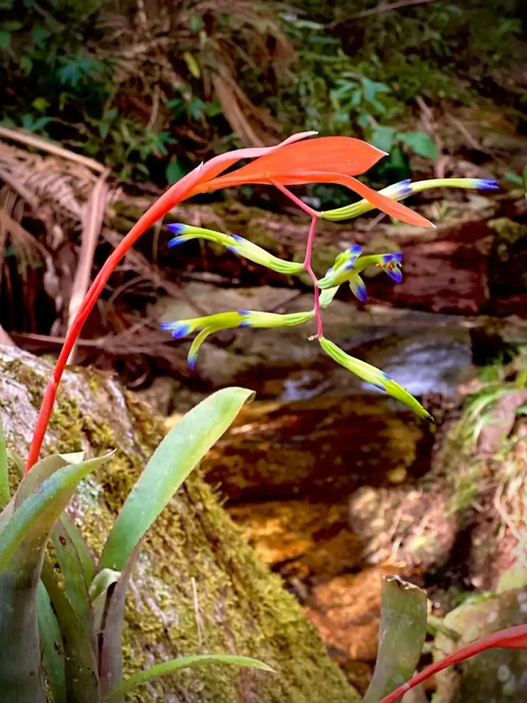
Want to see the flower that inspired the logo up close? Go to Café GaiaIn Vila Mogol, there is a vase with a live specimen of the Billbergia distachiaIt comes with a label with its scientific name.
The agronomist from Ibiti, Janice VentorimShe explains that the logo design represents the flower still in a closed bud, before it fully opens. "It represents the natural cycle of regeneration, which begins discreetly but is full of life," she says.